Most websites in today’s market are nothing more than expensive digital brochures. They look “clean,” they are “modern,” but financially, they are inert. If your website isn’t generating leads or sales while you sleep, you don’t own a digital asset; you own a hosting bill. In the high-stakes economy of 2026, Conversion-Centric Web Design is no longer an aesthetic choice—it is the bedrock of an aggressive scaling strategy.
In the attention economy, aesthetics are no longer a differentiator—they are the price of entry. The difference between a site that “looks professional” and one that dominates the market lies in its ability to force a decision. This isn’t art; it is behavioral engineering applied to the digital interface. For e-commerce businesses and service providers, moving from vanity-driven design to result-oriented design is the only path to real-world profitability.
The Architecture of Persuasion: Beyond UI/UX
Conversion-centric design starts with a brutal premise: your user is impatient, skeptical, and overstimulated. An effective website does not ask for attention; it commands it through strategic direction. When a visitor lands on a page, their brain processes the visual landscape to find cues of safety and utility in less than 50 milliseconds.
Information architecture must follow the “Path of Least Resistance.” Every scroll, every micro-interaction, and every piece of white space must serve a single purpose: the elimination of friction. In a service-based business model, this means validating authority instantly. In e-commerce, it means reducing the steps to checkout to an absolute minimum.
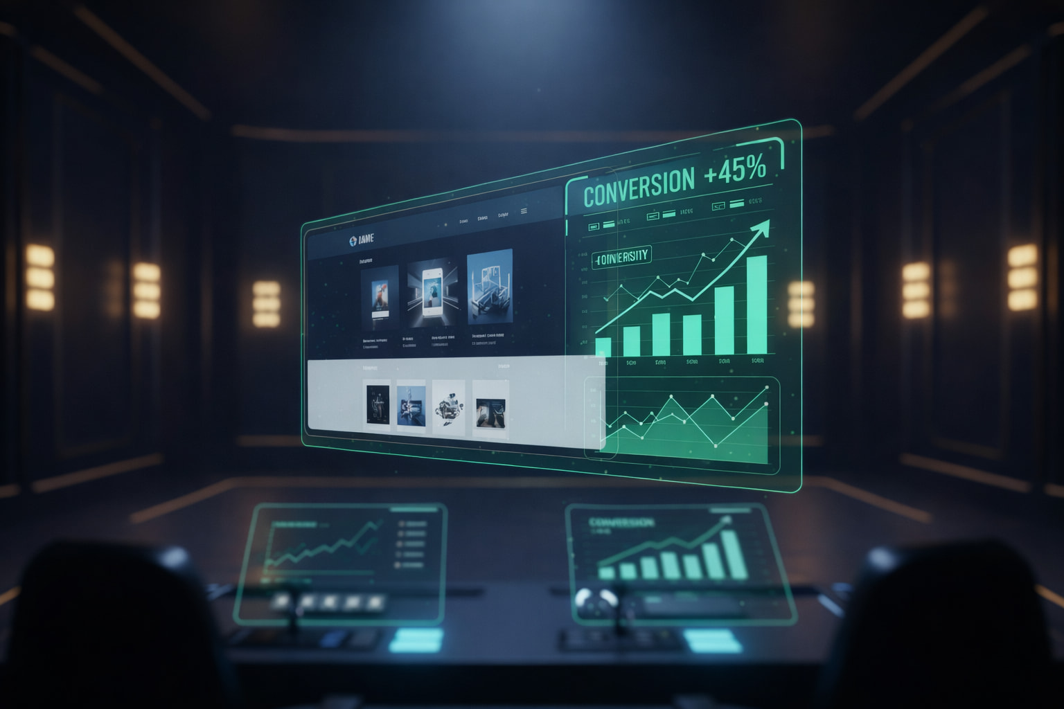
When we implement Conversion-Centric Web Design, we don’t ask, “Which color looks better?” We ask, “Which color visually prioritizes the Call-to-Action (CTA) button within the context of the user’s peripheral vision?” This level of rigor transforms passive browsers into active buyers. According to research by HubSpot, simplifying navigation and clarifying the value proposition can increase conversion rates by up to 20% without increasing a single cent of ad spend.
Conversion-Centric Web Design: Decoupling Vanity Metrics from Revenue
Many marketing agencies brag about massive traffic numbers. However, traffic is a vanity metric if the conversion rate is sub-optimal. A website with 1,000 visitors and a 5% conversion rate is infinitely more valuable than one with 10,000 visitors and a 0.1% rate. Why? Because conversion efficiency determines net profitability.
Result-oriented design acts as a force multiplier for your marketing budget. When your site is optimized to convert, every dollar invested in paid media (Google Ads, Meta Ads) becomes more profitable. You are no longer just buying clicks; you are buying predictable outcomes. This approach transforms web design from a branding expense into a cash-flow-generating asset.
For a service-based or B2B business, this type of design involves the organic integration of “Trust Signals”:
- Proof over Promises: Placing testimonials or client logos at the exact moments of maximum hesitation (e.g., right next to the lead capture form).
- The 5-Second Rule: The user must understand what you sell, how it solves their pain, and what to do next within the first 5 seconds of the page load.
- Cognitive Load Reduction: Removing distractions. If a link does not bring the user closer to the conversion goal, that link has no place on the landing page.
Eliminating Sales Friction with Strategic UX
Friction is the invisible enemy of profit. Within the Conversion-Centric Web Design methodology, we analyze every psychological and technical barrier. If your form has 10 fields when it could have 3, you are losing money on every user who feels overwhelmed. If your site takes 4 seconds to load instead of 1.2, you lose over 50% of mobile traffic before the first image even fully renders.
Friction isn’t just technical; it’s informational. If a potential client has a critical question that your site fails to answer (e.g., “How long is the implementation?”, “Is there a guarantee?”), they will leave for the competitor who offers clarity. A sales-optimized site anticipates objections through “Objection Handling Design”—dynamic FAQ sections, process blueprints, and strategic copy that cancels out doubt before it becomes a reason to bounce.
Research from the Baymard Institute shows that optimizing the checkout process and removing mandatory account creation can recover billions in lost sales annually. This is the essence of result-centered design: turning obstacles into bridges.
The 24/7 Sales Machine: Automation and Scalability
Unlike a salesperson, no matter how talented, your website doesn’t need a break, doesn’t have bad days, and never forgets to follow up. Conversion-Centric Web Design turns your URL into an asset that produces value constantly, regardless of the time zone or your team’s workload.
This approach allows businesses to scale without linearly increasing operational costs. Once the conversion infrastructure is built and calibrated via A/B testing, your only job is to feed the engine with qualified traffic. Design becomes the backbone of your growth, giving you the freedom to focus on service delivery while the site handles the “heavy lifting” of the sale.
A site built on these principles includes:
- Strategic Lead Magnets: High-value offers in exchange for contact data to capture visitors who aren’t ready to buy “right now.”
- Automated Scheduling Systems: Integrations with tools like Calendly or SavvyCal to turn interest into an instant meeting.
- AI-Powered Chatbots: Providing real-time support and qualifying leads before they ever reach your sales team.
Color Psychology and Visual Hierarchy in Conversion
We cannot talk about conversion without touching on the psychological aspect of design. Visual hierarchy guides the user’s eye in a logical order (The F-Pattern or the Z-Pattern). In Conversion-Centric Web Design, we use contrast not for “beauty,” but to create psychological anchor points.
[Image illustrating the F-pattern and Z-pattern of eye-tracking on a webpage]
Colors are used to evoke specific emotions: Blue for trust and security (essential in cybersecurity and fintech), orange or red for urgency and action (essential for purchase buttons). Every chromatic and typographic choice is tested to see how it influences the visitor’s final decision.
Conclusion: Stop Designing, Start Engineering Results
If your current website is just an “online presence,” you are effectively invisible to the clients who matter. The saturated market of 2026 will not reward you for having a “pretty” site. It will reward you for clarity, speed, and a user experience that removes every trace of doubt and provides an immediate solution.
It is time to view web design through the lens of Return on Investment (ROI). Every pixel on your landing page must justify its existence through measurable performance. Switching to a conversion-centric design is the moment your business stops “chasing” clients and starts attracting and processing them in an industrial, efficient, and predictable way.
Ready to transform your website from an expense into a profit generator? Book a strategy session with Designx. Let’s build the sales machine that never sleeps and turn your vision into a solid financial reality.